Even though these days we have lots of options to "show off" our design work through social media such as Instagram, dribbble, and behance. But, creating your own website is like creating a “home” for the various types of social media on the internet to feed off of.
In addition, creating a personal portfolio website has many advantages, including:
Additional information:
Role:
Tools:
Duration:
Step 1: Understand the needs
Step 2: Information Architecture
Step 3: Design Research
Step 4: Design on Figma
Step 5: Developing
Step 6: Test
Since this is a from-me-to-me project so all brief to build this website is absolutely from me but also I do the desk research for reference. So, my needs are:
I only made 3 pages because of the limitations in Webflow basic features. Besides, I also want to make a web portfolio that is easily accessible. So I made 3 pages plus 1 working page. For more details, you can see the diagram below.

After creating Information Architecture I created a wireframe. There are 4 pages that can be connected to each other.
Home Page: Contains all content on the web, Work, About, and Contact. Because I want, with just one scroll, the user or recruiter can see and judge me both in terms of background and skills.
Contact Page: Loads more complete content from the Contact section in the footer. There is a direct email subject and body template.
Works: Loads all work results by arranging them to form a collage, there is information on each work such as title, and category.
Work Page: Loads a complete and detailed work result. Starting from the title, category, description, design, even an explanation if any.

Like designers in general, I look for references on websites such as dribbble, behance, and also interest. After surfing on the internet, here is my inspiration board.

Usually, I only look for 2-3 references to make a design, because too many references will overwhelm me with choices.
Even though using Webflow is easier than using the code-based tool, I still prefer to design it first in Figma, because it's quick and easy to throw out all my ideas from my head quickly into a canvas.
Tools: Figma
Frame Size: Width - 1440px, Height - Auto
Work Duration: 2 Days

I only made one Home page as a prototype and reference, the rest of the pages I designed directly at the development stage with references to the font size, color palette, and style of this Home page. This is for simplicity-sake and saved time.
I want to make a portfolio website that is simple and full of valuable information by only doing one scroll. For more details, here is the explanation.
.png)
.png)
.png)
Today we have so many option web builders that don’t require coding skill. Like Wix, Squarespace, Typedream, and Webflow. Me personally choose Webflow because it has more flexibility on design. Even though using Webflow it is not as easy as other no-code web builders.
The breakpoint on the Webflow that I use is 1440 because I want the final design not to be too wide so it's easy to read. As for the content width, I made a maximum of 1100px so that all content can be read easily.
The optimal width is generally between 940px - 1000px width. Some designers will set their design field wider (up to 1440px), but will place guides at 1000px so that content stops at that width. www.lemonandthesea.com

In this development stage I divided it into parts to make it easier to understand, namely:
Responsive Web Design is a design strategy that creates websites that work well for desktop, tablet, and also mobile. So, it doesn’t matter what device you going to use, I hope this website has equity user experience.
.png)
.png)
.png)
.png)
All Size Screens have the same content, only there are several different placements, in order to achieve an equity user experience. Like making the "Scroll down" button on Mobile Portrait bigger and in the middle so your thumb can reach and click it easier. Also, the navbar button that turns into a hamburger button makes it easier to reach by hand and doesn't take up too much space.
The design style will explain how I chose the Typeface, Color Palette, and other Ornaments. Starting from the first one that is,
In my portfolio website, I use 3 typefaces, namely Bebas Neue and New Spirit as accents and complements, while Neue Haas Grotesk as the main typeface. Keep in mind that in a design project it is not recommended to use more than 3 typeface, because it will looks clutter and not cohesive. Here are the Neue Haas Grotesk fonts guideline I've used on a few different screen sizes.


I prefer dark mode in accessing the web or applications, therefore I made a dark background, with a bright green accent to be used on components that I want to emphasize like CTA button for example.
This portfolio website is not only for showcase, but also for gathered data, so I know how many people visit my website. Thus, I set up Google Analytics on my website. The step is pretty simple,
First Step: Click the link like image below

After clicking that link you will go to Google Analytics Home, just register as usual, and complete all the data needed.
Second Step: After registering your account and completing all the data, choose Web

Third Step: Then type your Portfolio Website URL and Stream Name

Last But Not Least Step: After you get the Tracking ID/Measurement ID copy it to Webflow Tracking ID.
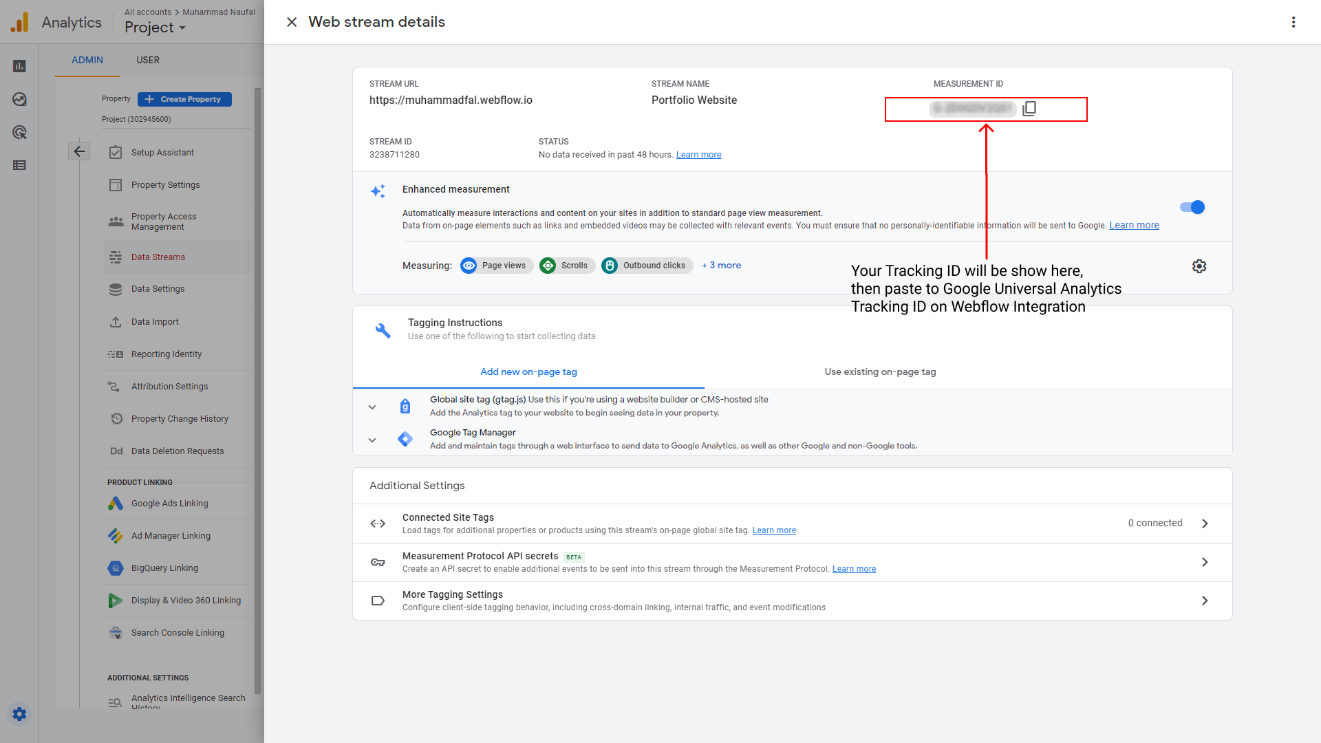
Youre Google Analytics is ready!
But, this Google Analytics needs time to gather data so it won’t instantly gather all those data in a day, be patient!
I have 2 testing variable. First, Visual Responsive because I want to know what my portfolio website looks like in any device. Second, Performance using Google Lighthouse and we will know how fast my portfolio website is. Because I believe a good user experience is beyond visual.
As designed, this portfolio website is responsive to various platforms. You can try it on your own using Google Chrome desktop then press F12 to change the resolution.

Lighthouse is an open-source, automated tool for improving the quality of web pages. You can run it against any web page, public or requiring authentication. It has audits for performance, accessibility, best practice, SEO, and progressive web apps.
So, this is my very first Google Lighthouse result for mobile devices.
.png)
I find out that a lot of photos has too much size, so made the loading page slow, you can see the Largest Contentful Paint takes 13.1s to load. To overcome this problem I compressed multiple photos to make sure they have the best size and the best quality.
So, this is the result
.png)
Yet, this is not perfect. But, after doing little improvement my score increase 10+ points to 77 on performance is not bad.
Meanwhile, if I test for desktop the result is way better than for mobile. Here is the result
.png)
With all the results obtained, it provides information that my current portfolio website is better accessed via desktop because it has a faster loading page than if accessed on mobile devices.
I am very happy because I can create my own website portfolio after a long time. I hope that in the future I can explore better and more unique designs without fearing that it will be difficult to develop them.
Thanks for reading 🙏
You can check my website at:


